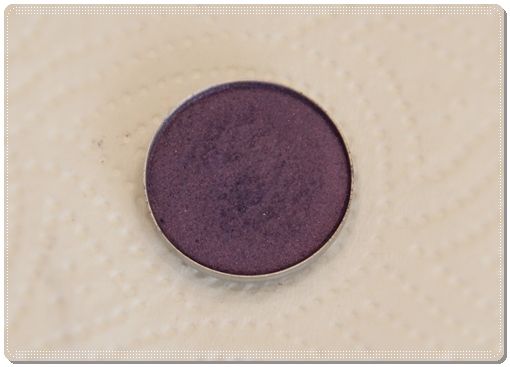
More reviews by CatrionaShadowleaf
PA is not the colour it looks to be in the pan. Definitely veers hard towards blue instead of the nice purple-blue it appears to be. It also goes on fairly sheer even if you build it up. Wetting it probably helps, but blues look so awful on me that I'll probably try to swap it instead.
Its an absolutely gorgeous COLOR ,extremely silky and blendable duochrome.
The color is very buildable and very pigmented .
actually i think it would work with almost every eye color and it works magic on your under waterline.
I really like purple colors, and I bought this thinking it was a really pretty purple! When I got it home and used it along side my UDPP, it looked more blue! Someone even complemented me on how pretty of a blue my eye shadow was :( So from now on, I will swatch MAC colors before I buy!
NW10 (neutral-cool toned, very fair), blue eyes, Color season is True Summer, Baumann Skin Type is OSPW.
This shadow is more work that it is worth. Like many reviewers have said before me, it is hard to blend and if you don't use a primer / apply it wet, it barely even shows up. I'm disappointed in the quality. Save your money on this one.
I love this es. However, i find i have to apply it wet to get the best effect. If i apply it dry, its a difinite "no show", even with UD original primer potion. The colour of this when applied wet with Napoleons "cake eyeliner sealer" is really eyecatching and beautiful. I just love how this colour catches the light and is just simply gorgeous. I would definitely recommend and repurchase. Its my favourite purple at the moment.
I saw this in the MAC store and I passed it up the first time thinking I have lots of purples and pinks in my collection then I got the chance to swap for it and thought eh why not. I got it and now i adore it the thing I use it most for is my jeffrey campbell X black milk inspired look to match the shoes it is a staple color and for me having green eyes it really helps to make them brighter.
Though I am no stranger to both subtle and dramatic eye looks, I was a bit stupefied with this particular shadow...I found it a bit hard to blend so I needed a mid-tone between this and MAC Crystal to pull the look together sufficiently. Until, I layered it a bit with another fuscia eyeshadow in the centre of my lid (not too much, just a touch) and it really brought out a lovely purple. Pair that with a bit of MAC Crystal blended into the inner corners and it's a dramatic purple spectrum that's great for evenings. Eyeshadow primer is a must with this one, at least on my NC40 skintone or else it will come off looking grayish and dirty. I still find the pigmentation a bit poorer so I will try applying it wet as was suggested below. May not repurchase, considering how little I use it now. This and MAC Crystal don't even have dents in them yet...
I love this shade but the pigmentation could be better. I only wear this on my lid because when I tried wearing it in the crease, it wasn't blendable. .
I used to dislike this till I applied it wet and now I'm so glad I didn't swap it ! Applied dry it seems too sheer and bleh for me, sort of like a bad drugstore eyeshadow. However I've been applying it wet and its AMAZING , Its one of my fav Mac shadows now. I wear it alone all around my eye with lots of black kohl and mascara. It looks a lot like UD's Ransom if you're looking for a dupe.
1 out of 1 people found this review helpful. Did you? Yes No
COLOR: the MAC website describes 'Parfait Amour' as "Blue-violet with shimmer (frost)." That description is accurate, but it appears a lot darker in real life than the swatch on the website. I would say it's a mix of royal blue and royal purple with shimmer (not glitter!). Basically it's a multidimensional indigo.
_____________________________________________________________
TEXTURE: I find this to be more like a cross between a frost and a veluxe pearl. It's like a veluxe pearl because of how smooth and multidimensional it is - but it's a frost because of the finish, it shows up a lot lighter when you apply it than it appears in the pan. So if you are intimidated since it looks too dark in the pan - it actually goes on a bit lighter!
_____________________________________________________________
There is, however, a reason why I gave this 4 instead of 5. It is a gorgeous, deep, blue-violet/indigo color, but it was not dark enough. My sister wanted this for her prom since it was the color of her dress - I blended this on the outer corner with 'Seedy Pearl' on the inner corner. Obviously I knew I would have to use at least one other shadow to finish off the look, but I had to use another dark blue shade (Prussian) and dark purple shade (Fertile) to get it to look right. It took a lot more work than I expected, and I am not new to MAC eyeshadows, blending colors, or creating different/colorful looks. All in all it's a beautiful and unique shade, and it was worth the extra work.
_____________________________________________________________
I selected would not repurchase because I don't use this often and probably won't need to buy another one.
Just bear in mind that it's lighter and smokier than it seems.
3 out of 3 people found this review helpful. Did you? Yes No